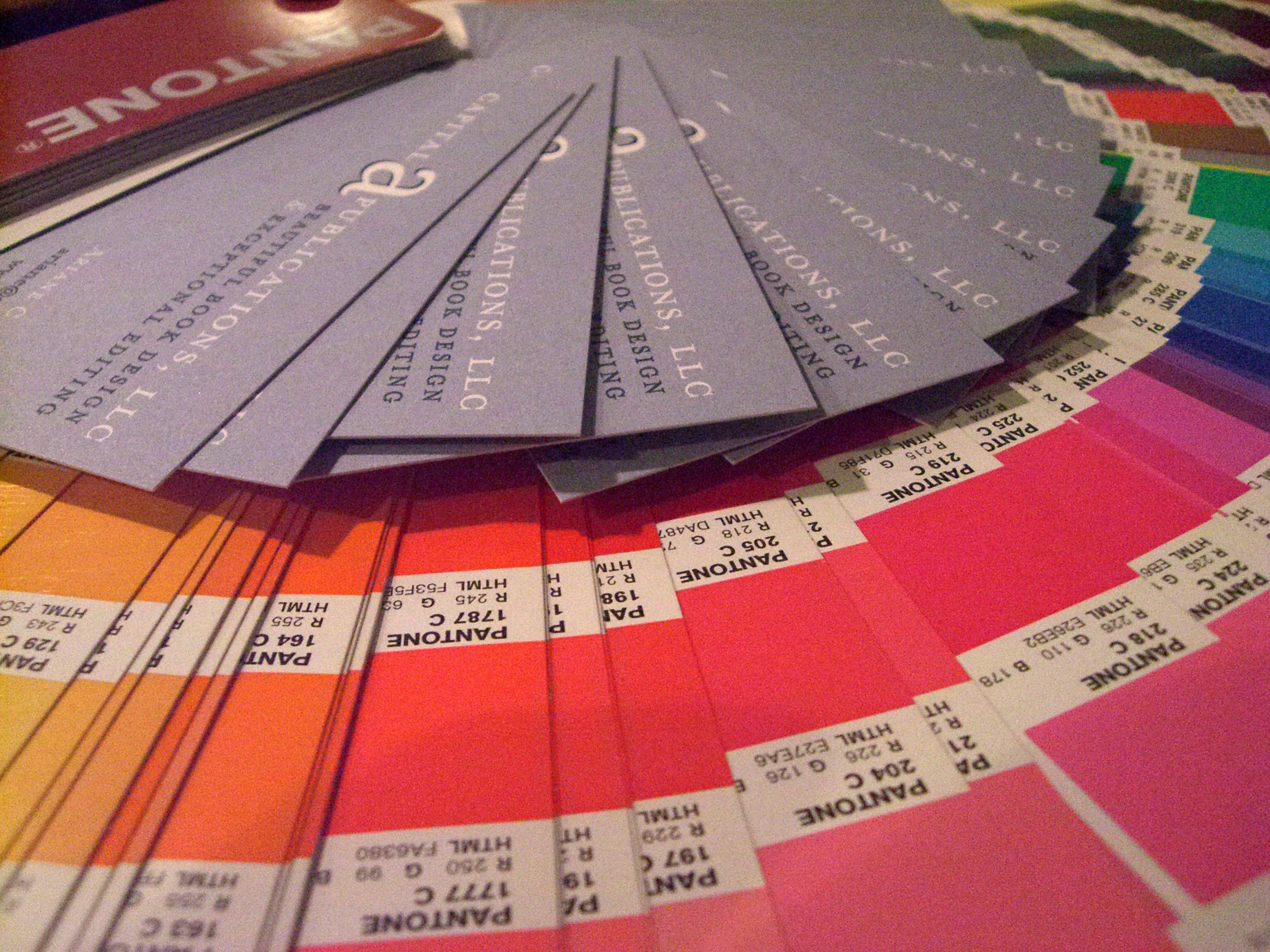
Beautiful Pantone colors made beautiful business cards for Capital A.
So what sparked this explanation of the Pantone color-matching system? Cookies. Pantone chip cookies, beautifully crafted by a blogger and designer in need of Christmas gifts for her colleagues.
Detailed cookie making isn’t part of our plan for this fall, but the use of Pantone’s colors are. Capital A’s business cards feature PMS 3025, a lovely shade of teal, and 536, a complimentary light blue. Our mailing labels also use PMS 3025, with the name of the company accented by the same shade it is written in, but at a tint of somewhere near 75 percent. The use of one color in two or more tints can save a lot of money. Any publication would be smart to use Pantone for this reason and many more, but let me explain just what it is first.
Historically speaking
In 1963, Pantone founder Lawrence Herbert noted a huge problem with color consistency in the graphic art community. I’m sure he dreamed in rainbow before designing the template of colors known as the Pantone Matching System, a book of standardized color. Although there are many guides, the one most commonly used, and in our possession, is the Pantone 4-color solid-to-process guide.
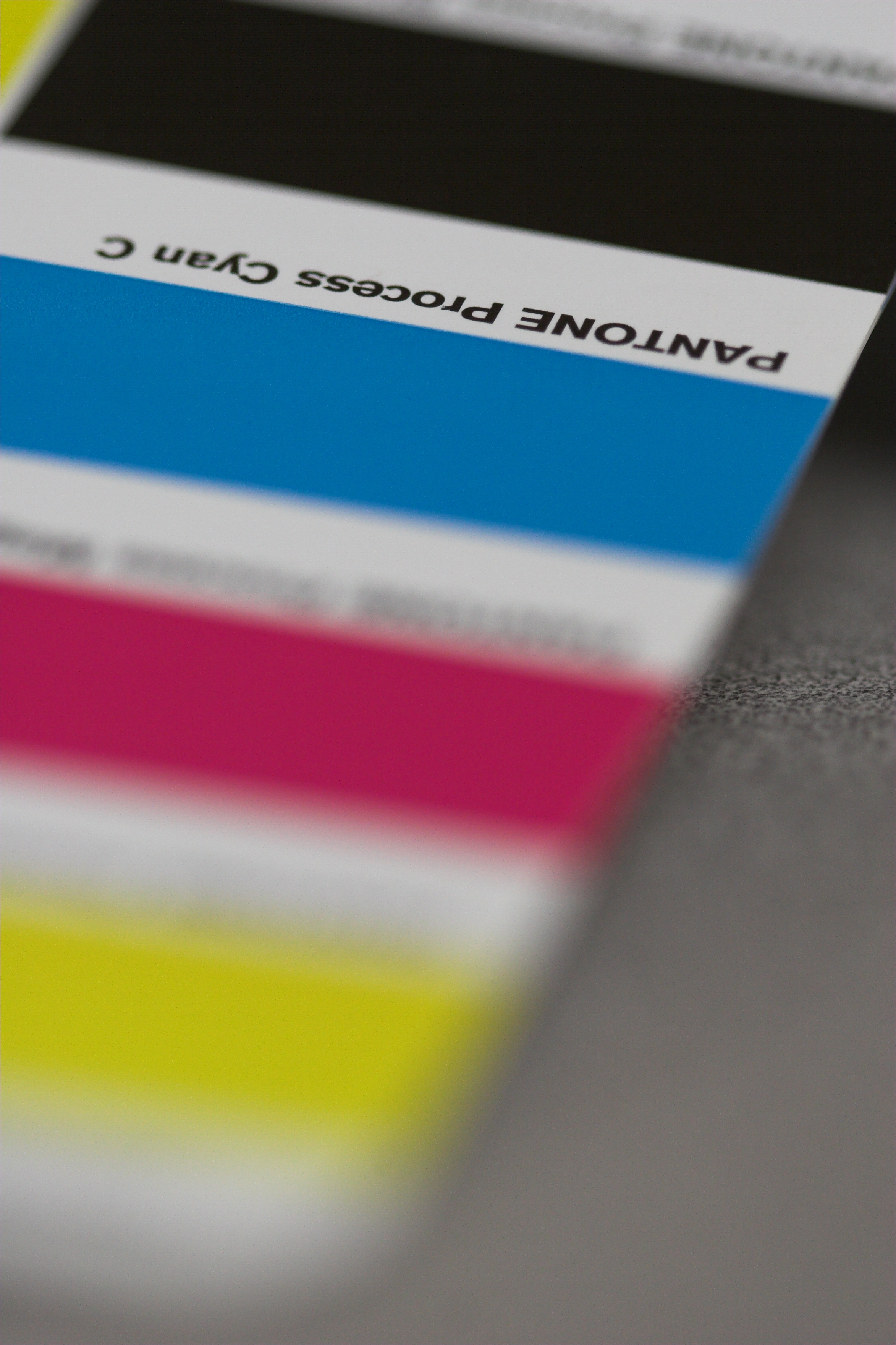
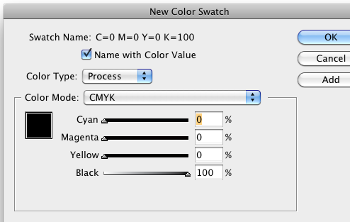
Photo of the Pantone guide for the basic CMYK model. Photo courtesy of Sean Girard.
CMYK is a subtractive color model that refers to the four colors used in most color printing: cyan, magenta, yellow, and key or black. The first three inks are keyed or aligned with the black plate. The colors are used in a fashion that subtracts from the white that is the background being printed on.
CMYK colors that are viewed on computer monitors, output devices, and printing presses can look different on screen than they do in print due to monitor and press variations. After a little experience with color inaccuracy in print, you’ll understand how helpful this is!
Keeping the pig in pigment
So why use Pantone? You can benefit from Pantone in so many ways (a lot of them dealing with minimizing stress) because you know your color is going to look great every time. There is no variation throughout the printing process. For example, if you are printing 10,000 copies, the color might not remain consistent throughout the run. Variations on the press can affect the way the colors look in the first 8,000 copies in comparison with the last 2,000.
Temperature and humidity can also affect press conditions. PMS colors guarantee consistent color even when influenced by outside elements as well as different types of paper. Swatch books allow users to know how their colors will turn out on coated, uncoated, and matte stock.
CMYK, when applied to a large, blank area, produces color in dots. If you look closely, the pattern is recognizable. Pantone diminishes this problem by making the color look smoother, without the dot pattern. Check out the back cover of a journal sometime and you’ll easily be able to find out whether it was printed with PMS or CMYK.
Capital A: tinkled pink by Pantone
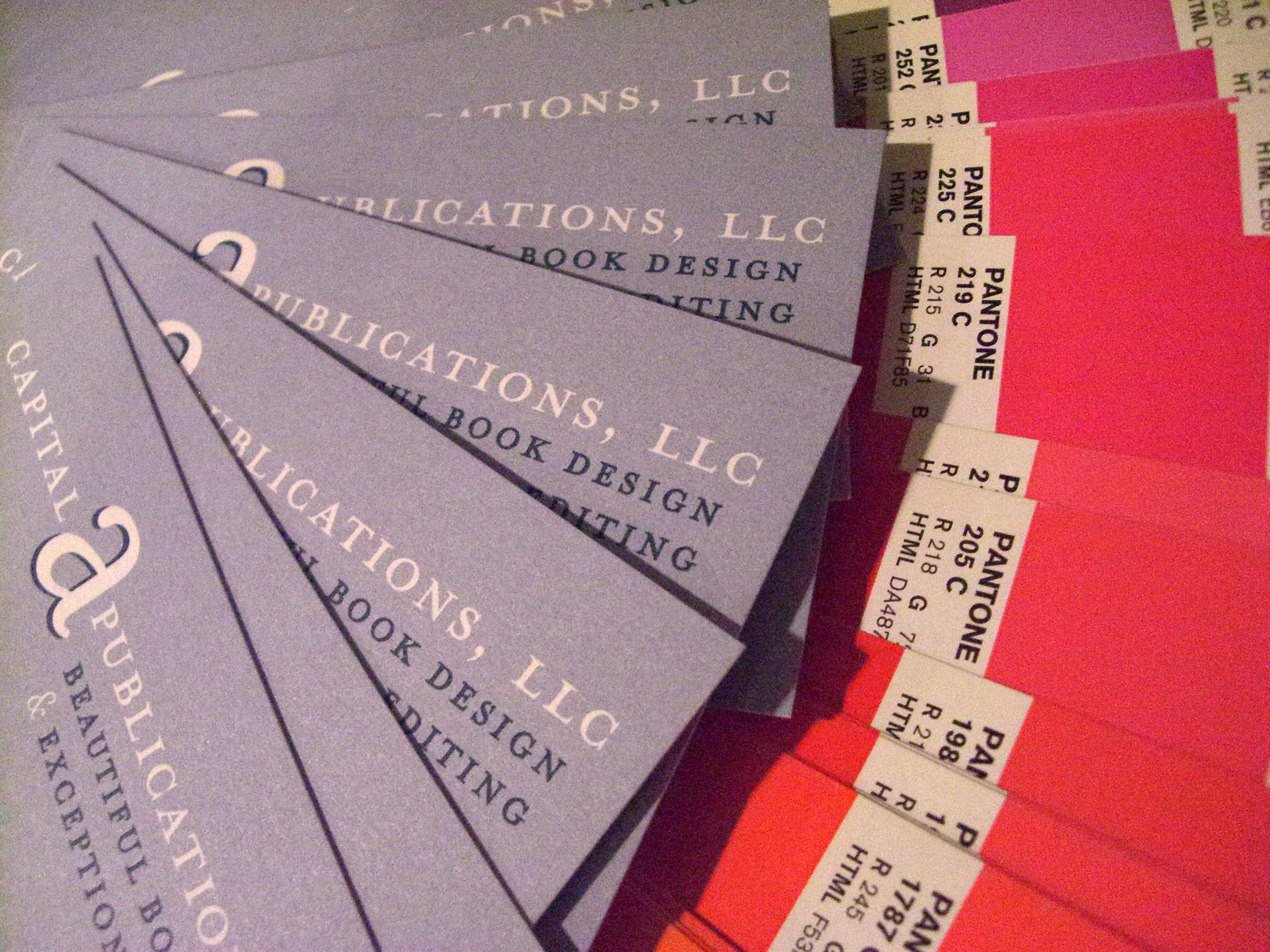
Close-up photo of our use PMS colors on Capital A business cards.
Now that you know what Pantone is, and what they are capable of, you may be wondering why we are so intrigued. Remember those business cards I talked about? They were printed with only two colors, instead of the four colors that would have been used had they been printed with CMYK. Using less colors creates less expense for printing. And the mailing labels? Even though it looks as though there are two colors in the writing, there is only one. The emblem of the company is written in 100 percent color while the rest of the title was printed in 75 percent. When using more than one tint in the same color, it is considered one color. It’s like double-dipping with the knowledge that you’ll ALWAYS get away with it. So why not try it?
Pantone in InDesign
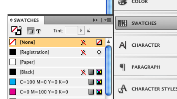
Screen shot of "swatches" panel.
PMS colors are easy to use in InDesign as well. Here is a quick demonstration on how to add them to your swatch panel.
Screen shot of box that allows you to change color mode.
First, click on the Swatches panel to expand your options. Then select the small gray box at the top right. The box has three horizontal lines and a down arrow on it. Clicking this will give you several options. Choose “New Color Swatch.” A new box will pop up in the center of your screen. Now choose from the drop-down list that will appear after you click on “Color Mode.”
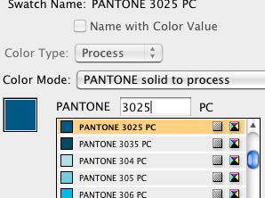
Screen shot of our choice: PMS 3025
From the long list provided, choose “PANTONE solid to process.” This is where it gets fun. A very extensive list of colors appears. You can either choose the one that you like best visually, or choose a color by the number provided as a guide. In this demonstration I am choosing PMS 3025, the color used in our business cards. Once you have decided on your color, click OK to return to your document. After completing all of these steps, check out your swatches panel. Beneath CYMK and the other basics you should see the color you just chose, as you can see in this screen shot. See how easy InDesign has made using Pantone in all of our documents?
Pantone’s branches and buds
Not only does Pantone provide guides for the computer world, but they have expanded their industry to play a role in nearly every area of our lives. Their Fashion and Home division covers a fashion color report for each season, announcing predictions for the hottest colors of the year. Products in those colors are provided for interior design, apparel, dishes, and more. For fall 2011 be sure you don bamboo, cedar, deep teal, or phlox. As for the 2011 color of the year, honeysuckle, a vibrant shade of what you might call watermelon or plumeria or just simply pink, claimed the prize. According to the Pantone website, the color is encouraging and uplifting and will elevate your psyche. So get your honeysuckle on!
A line of Pantone paint was established in 2006, after beginning a partnership with Fine Paints of Europe. Over three thousand colors can be found in their paint section. Color families, colors by number, and extensive palettes can be found online to help you choose the right color for whatever it is that needs a coat of shine. The paint line has been helped interior gurus and designers match paint choices with Pantone’s home design options and accessories.
Next time you purchase Tupperware or cheap garden furniture, keep in mind that Pantone works with plastic as well. They have found ways to produce their colors in opaque and transparent forms so that corporations are able to reproduce their colors after selecting, specifying, and manufacturing their goods.
Corporate tools and guides
Pantone didn’t stop there. They continued to add to their resume, adding tools and guides for the corporate world as well.
Color Cue 2 is one of the newest inventions. It is a portable device that is programmed with Pantone color data. When placed next to any flat surface, the device will identify which Pantone color matches the closest with the shade in question. Interior designers have found the product very helpful in ensuring everything in their design is coordinated.
Retail stole the show for TheRightColor, a system that enables retailers to provide a color standard for their products. The consumer’s shopping experience has been improved by the use of colors that affect them positively. Another important aspect of TheRightColor is its ability to minimize merchandise returns due to inaccurate color representation. Dole, among other banana growers, has found Pantone useful in fruit sales. Pantone has developed banana guides with an array of shades a banana may turn within its span of deliciousness. The perfect color for bananas is “buttercup,” in case you choose to go this route!
Pantone fan. Photo courtesy of Sean Girard.
Pantone Universe is a hub for lifestyle products designed with the hottest colors of the season in mind. Whether you need a new couch and curtains, a car seat, or a pair of honeysuckle pumps, Pantone Universe has it. Shopping the Universe line couldn’t be complete without the Pantone shopping color guide. This panorama of colors fans out for easy use and keeps you from needing to wipe your brow during the exhausting process of shopping.
Three main software products have also been developed by Pantone, each directed toward graphic designers, pre-press professionals, business users, Web developers and even Internet surfers.
Powerhouse Pantone
It seems as though Pantone has accomplished all they could think of since 1963. But wait, here is one more tidbit. Pantone provides colors for corporate identity and assists any industry requiring color accuracy. The Pantone Color Institute researches and provides information about how to use colors, how colors affect people, and much more.
T-Mobile is a great example of the use of color as a corporate identity. In their disclaimer, they announce that their logo, including the color magenta (PMS Rhodamine Red) and gray (PMS Cool Gray 7), are registered trademarks of their company. It has caused quite the controversy! Take a look.