Here I am, over two years later, finally getting updated! My Capital A work did not come to a halt in May 2017—on the contrary, my workload ramped up, to the point that something had to give . . . and apparently, it was the website that fell by the wayside.
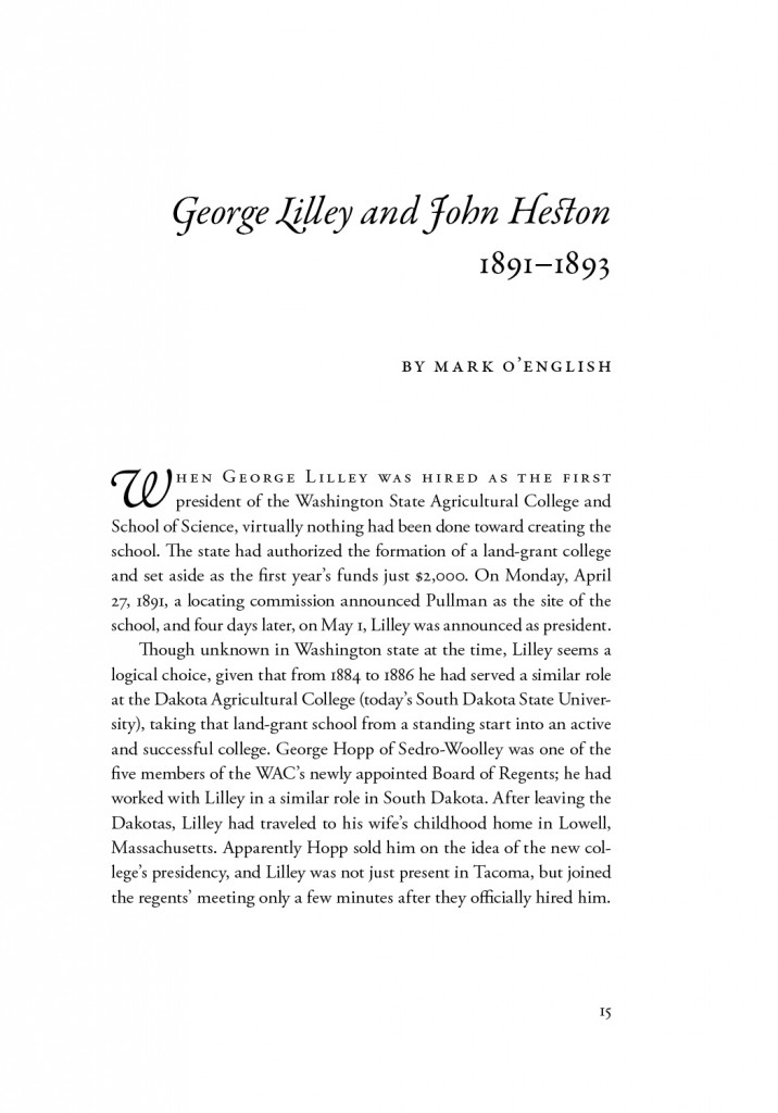
Last year, I did my first project for WSU Press! (It was a happy coincidence but unrelated to the iBook design that I do for the WSU medical school here in Spokane.) I only did the text, not the cover; here’s a sample. The editor-in-chief specified the trim size, margins, and font, but I got to run with the rest of the design. I was glad Garamond was chosen, since it’s a full typeface, with lots of good swashes and ligatures to fancy things up.
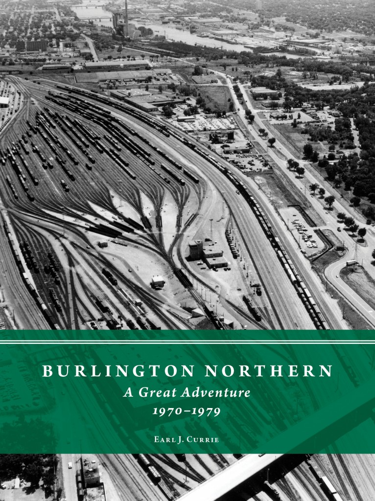
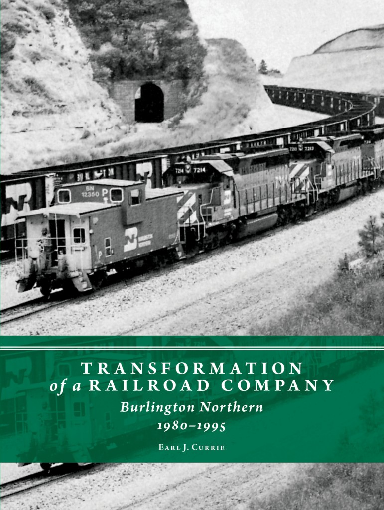
My most recent project, also being distributed by WSU Press (and the hardcover is sold out already!), was Burlington Northern: A Great Adventure, 1970–1979, and Transformation of a Railroad Company: Burlington Northern, 1980–1995, by Earl J. Currie, a former senior vice president–Maintenance and Transportation at BN. I covered the editing, indexing, design, covers, and production specs. The books are fascinating, a tremendous source of institutional knowledge that covers the operations and culture around bringing different companies and workflows together successfully—the author discusses leadership styles and how (or if!) they led to good outcomes.
The dust jacket stock is just stunning and has to be seen (and felt) in person to fully appreciate. The author was inspired by a cover that he had seen with original watercolor art. That is decidedly not my strength, so my suggestion was to use a stock that felt and looked like watercolor paper: uncoated, nice and thick, with a rich, plush feel. Mohawk Felt was the answer!
The images on the covers felt metaphorical (besides just being visually interesting). Volume 1 covers the merger of four railroad companies into one . . . thus the yard where so many tracks combine into few.
Volume 2 is BN turning a corner, changing its business practices considerably from the way it was run until around 1980. I also liked this one because the books talk a lot about improving rail routes, for which the curvature of a line must be taken into account.
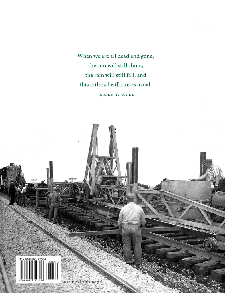
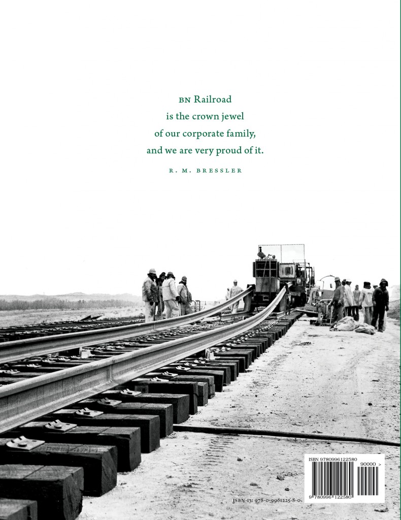
I especially love the back covers, very spare with those crisp historical images and poignant quotes right in the white space. The images show the literal construction of the railroad, which the author covers in detail, especially in volume 1.
Of course, we used the classic emerald green that was Burlington Northern’s signature color, both on the cover and on the endpapers. (Luckily for us, the greens matched almost perfectly! Green can be so tricky.) The author specified a really elegant 70-pound matte text stock, so these are books with real heft to them.
These two books pretty much filled my schedule over the last two years, but I have a couple other editing projects that I’ll update here soon!
