OJ in color!

I’m very excited to say that Overland Journal has finally made the shift to printing in full color! Here are a few samples from the fall 2019 issue.

A page from the fall 2019 Overland Journal.

I changed up the table of contents to highlight one of the author’s striking photos—we had run out of room in the article to run it very big, but it was too beautiful to run small.

The new table of contents in the fall 2019 issue. The list of articles was relatively short, so running it only in the sky/background left that glorious field of sunflowers in front of Courthouse and Jail Rocks uncovered.

The blue from this image set the spot color for the rest of the issue—cyan is one of my favorite colors, so running this art across the gutter to introduce the article was an easy decision.

Ah, that blue sky!

Also, here’s an ad that I ran in an issue of OJ earlier this year. I had been going through some back issues and felt really proud of all the covers I had designed. Putting them together highlighted how consistently beautiful the covers have been. I still can’t decide which one is my favorite!

Cyan again!

Posted in Uncategorized | Leave a comment

So long overdue

Here I am, over two years later, finally getting updated! My Capital A work did not come to a halt in May 2017—on the contrary, my workload ramped up, to the point that something had to give . . . and apparently, it was the website that fell by the wayside.

Last year, I did my first project for WSU Press! (It was a happy coincidence but unrelated to the iBook design that I do for the WSU medical school here in Spokane.) I only did the text, not the cover; here’s a sample. The editor-in-chief specified the trim size, margins, and font, but I got to run with the rest of the design. I was glad Garamond was chosen, since it’s a full typeface, with lots of good swashes and ligatures to fancy things up.

A sample from Leading the Crimson and Gray: The Presidents of Washington State University.

My most recent project, also being distributed by WSU Press (and the hardcover is sold out already!), was Burlington Northern: A Great Adventure, 1970–1979, and Transformation of a Railroad Company: Burlington Northern, 1980–1995, by Earl J. Currie, a former senior vice president–Maintenance and Transportation at BN. I covered the editing, indexing, design, covers, and production specs. The books are fascinating, a tremendous source of institutional knowledge that covers the operations and culture around bringing different companies and workflows together successfully—the author discusses leadership styles and how (or if!) they led to good outcomes.

The dust jacket stock is just stunning and has to be seen (and felt) in person to fully appreciate. The author was inspired by a cover that he had seen with original watercolor art. That is decidedly not my strength, so my suggestion was to use a stock that felt and looked like watercolor paper: uncoated, nice and thick, with a rich, plush feel. Mohawk Felt was the answer!

The images on the covers felt metaphorical (besides just being visually interesting). Volume 1 covers the merger of four railroad companies into one . . . thus the yard where so many tracks combine into few.

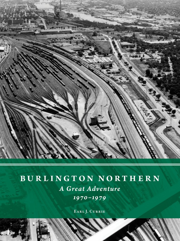
The cover of the first volume.

Volume 2 is BN turning a corner, changing its business practices considerably from the way it was run until around 1980. I also liked this one because the books talk a lot about improving rail routes, for which the curvature of a line must be taken into account.

The cover of the second volume.

I especially love the back covers, very spare with those crisp historical images and  poignant quotes right in the white space. The images show the literal construction of the railroad, which the author covers in detail, especially in volume 1.

The cover of volume 1.

The back cover of the second volume.

Of course, we used the classic emerald green that was Burlington Northern’s signature color, both on the cover and on the endpapers. (Luckily for us, the greens matched almost perfectly! Green can be so tricky.) The author specified a really elegant 70-pound matte text stock, so these are books with real heft to them.

These two books pretty much filled my schedule over the last two years, but I have a couple other editing projects that I’ll update here soon!

Posted in Uncategorized | Leave a comment

The spring Overland Journal cover

The back (left) and front cover of the Spring 2017 issue

I’ve been saving this image for years, just waiting for the right Overland Journal to come along. The focus of the spring issue is Council Bluffs, Iowa, the site of the upcoming annual conference, but none of the articles specifically discussed the Mormons, whose Winter Quarters were situated right across the river. This map, showing the Mormon Trail from Illinois to Utah, worked perfectly for this edition in multiple ways.

First, it is a dynamo image, with that deep, grainy color and texture that is similar to the spring 2016 cover shown here. It shows the location of Council Bluffs and Winter Quarters right at the junction of the two rivers and their proximity to other jumping-off points for overland travelers. It also tells a story in an instant, with the covered wagons heading west (onto the back cover), with prominent trail landmarks sketched and the dates of camp. (The dates are based on the journals of Orson Pratt, who traveled west with the Brigham Young Pioneer Company. Campsites and dates are marked by black dots, and mileage is also indicated. Pratt was also one of the Twelve Apostles of the Church of Jesus Christ of Latter-day Saints.)

Second, we were able to run the full image inside the text, accompanying a reprint of “The Council Bluffs Road,” an article by trail historian Merrill Mattes. Mormons and the Mormon Trail are one of the topics of the article, so it beautifully illustrated his points, stretching across the two-page spread.

Finally, we hadn’t run a map on the cover in years, which Marlene, my editor-in-chief, and I both wanted to do. Voilà: a perfect image! I just love how it turned out.
———
On the cover: Detail of Route of the Mormon Pioneers from Nauvoo to Salt Lake City, Feb’y 1846–July 1847. Printed by Millroy & Hayes. Salt Lake City, c1899. 28 × 100 cm. For the full map, see Library of Congress, Geography and Map Division, https://www.loc.gov/item/gm69002272.

Posted in design resources, journals | Tagged , , | Leave a comment

More samples from last year

While archiving some files the other day, I remembered a few projects that I hadn’t written about last year. The first one is the design for Through Indian Sign Language: The Fort Sill Ledgers of Hugh Lenox Scott and Isseo, 1889–1897, edited by William C. Meadows.

Shown on the page on the left, the arrow sketch (taken from one of the illustrations) is a design element throughout.

This project was a little different because of the way the author wanted to call out some notes, shown on the image to the right. The wavy line was inspired by a different arrow sketch, which had a wavy line running down the middle. It was complicated to lay out, but the final project turned out very nice! We also had to use a different typeface than usual, because the text required many glyphs that were only found in this one, which was designed with phonetic symbols.

I just loved how this title page for Mapping the Four Corners: Narrating the Hayden Survey of 1875, by Robert S. McPherson and Susan Rhoades Neel, turned out! It is nice to use the full page spread—emblematic of the wide scope of the survey—for a change. The image was just dynamite, with the silhouettes of the surveyors on top of the cliffs. I also chose the four-piece ornament because it literally had four corners meeting up in the center!

Here is a page from Somewhere Over There: The Letters, Diary, and Artwork of a World War I Corporal, by Francis H. Webster and edited by Darrek D. Orwig. The time frame of this book is much later than my usual topic, and I wanted the display type to be a little bit special for a book about an artist. I chose Oneleigh because it had some flourishes to make it look distinctive but was not too full of flourishes. Also the way the ‘g’ was drawn was similar to how the author wrote the ‘f’ in his name on his cartoons.

This book has a color section showing some of Webster’s artwork; they are stunning!

Another title page with ornaments (this one for Sound the Trumpet, Beat the Drums: Horse-Mounted Bands of the U.S. Army, 1820–1940, by Bruce P. Gleason), which the production manager at OU Press declared to be lyres—how perfect for a music book! Linking them up into that long row reminded me of the lines drawn for music notes.

Posted in Uncategorized | Leave a comment

Happy winter!

This year’s Christmas card quote came from a diary of a pioneer in Overland Journal this spring; it reminded me of early mornings on the ski hill. Here is a look back at 2015′s card and 2014′s.
———
from Robert E. Davis, Following Sarah: Sarah Davis’s 1849–1850 Journey from Michigan to California (Twentynine Palms, Calif.: Quiet Creek Corporation, 2013), 71, in Robert E. Davis, “A Trek from Thomas Fork to Hastings Cutoff along the Bear River, 1850,” Overland Journal 34, no. 2 (Summer 2016): 54.

Posted in Uncategorized | Leave a comment

Catching up

Yikes! I can’t believe it’s been so long since I last updated. Here are few things I’ve been working on.

I continue to be proud of the new design for Overland Journal—it even inspired another quarterly to take on a new look! Here is the Fall cover.

Cover of the Fall 2016 Overland Journal

This issue had an article by William P. MacKinnon, author of At Sword’s Point, Part 2: A Documentary History of the Utah War, 1858–1859. I copyedited and designed this giant (698 pages) in 2016 (I worked on part 1 in 2008), and his article was a couple of great extracts from the book: anecdotes about real life during the war.

Another article in the Fall issue was on the design medallions that mark the Oregon Trail, also shown on the cover. Besides the fact that I love the layout on this page, it’s also a good example of the contrast between color and black and white—on the cover, we show the medallion in its place in the world, but the starker black and white shows the great detail in the sculpture.

Page from Fall 2016 Overland Journal

Working backward, here is the Summer cover of Overland Journal.

The back cover (left) and front cover (right) of the Summer 2016 Overland Journal

This photo of Chimney Rock was a dramatic change from the usual blue sky/green-brown ground. Running the spire of Chimney Rock off-center was an unusual choice for a symmetric subject, but I liked how it didn’t end up competing with the masthead, which we ran in white to compliment the moody sky. The photo was by Ray Schoch, and we ran a paragraph from his email as the cover caption, to set the stage for the reader:

Chimney Rock, July 21, 2015.
“I decided to depart from the most efficient route (I-80 to western Nebraska, then I-76 southwest to Denver) and followed the North Platte trail route from Ogallala to Scott’s Bluff. The day started in sunshine at Windlass Hill and Ash Hollow, but fifty miles later, clouds had rolled in and it was just starting to spritz a little rain at Courthouse and Jail Rocks. Another fifteen miles west and it was raining lightly, but steadily, at Chimney Rock.”

Another project from this past spring and summer was the design and production of The Rusty Dusty: Great Northern’s Wenatchee-Oroville Branch.

Title spread of The Rusty Dusty

The book looks beautiful! The publisher chose really nice white text stock so that the many images would reproduce well. The book is a hardcover, with charcoal cloth and bright orange endpapers, to coordinate with the colors from the painting on the dust jacket. Endpapers are one of those really small details that can effortlessly add a layer of dynamism to a book—it instantly makes it look more special.

Dust jacket of The Rusty Dusty

Here is information about the cover image, which the publishers commissioned:

Alco RS-2 number 203 has just entered the W–O line at Olds Junction on a winter afternoon in the early 1960s. Head brakeman and co-author John Langlot has opened the switch and reboarded the engine. When the train is past the switch the rear brakeman will reline it for crossover movement and train No. 698 will be on its way to Oroville. Watercolor by retired NP/BN/BNSF locomotive engineer Jack Christensen.

I spent a lot of the year working on (and the work on them continues, now that we have moved on to the design stage) an 1,100-page, two-volume set of legal documents related to the Mountain Meadows massacre, as well as an 800-page volume of records created during the Utah War. Never fear, though—I’m also finishing up work on a tiny little manuscript about a prospector; its entire length was the size of two chapters in my usual behemoths!

Posted in books, journals | Tagged , , , , , | Leave a comment

Moose tickets

A friend asked me to design some tickets for a set of concerts this winter. It was a fundraiser for a school called M.O.O.S.E., so naturally, we needed a large ungulate in the center! (M.O.O.S.E. stands for Magic of Oral and Signing Education. [I was being overly literal.]) Thankfully, my husband is a great photographer and had taken a series of moose photos the last time we visited Yellowstone, so I could comb through his files to choose just the right one.

Since there was going to be more than one concert, the design needed to be consistent—thus the change in color. Why the unnatural colors? To be fun, because concerts are fun. As was putting together a project like this! (Note that I blurred out the address, as it was at my friend’s house.) The fundraiser was a huge success, and the concerts sold out very quickly. Hooray!

Posted in Uncategorized | Leave a comment

More from the new Overland Journal

In the last post, I talked about the cover image and how I’d initially planned to wrap it around to the back cover. One of the aspects of the new design is putting more emphasis on the great images that we run. The reading list for the upcoming conference is a good example of that. Rather than just set a plain list, I put the full, glorious cover image across the two pages, then converted it to grayscale and screened it back so the text was still legible. It’s a fairly subtle effect, but it creates a sense of continuity with the cover and also means that readers do end up seeing the full image.

This list of suggested reading uses the full image that we cropped on the cover.

One thing that we are continuing from the previous design is the mailing wrap, with a quote from one of the articles. The one for this issue could not have been more perfect, as all of the articles are on the area around Fort Hall, which is on the Snake River.

The mailing wrap is still the grayscale version of the cover, with a pithy quote from the text.

The feedback from the new look has been very positive, including this note from the editor:

The issue is grand!

Posted in Uncategorized | Leave a comment

Sneak peek

Overland Journal is getting a whole new look! Check out the new cover. The issue is devoted to Fort Hall, in southeast Idaho, where the conference is being held in August. The cover image is a portion of Great Falls of Snake River, Idaho Territory, 1876, a chomolithograph by Thomas Moran. I chose it because of the bright, dramatic colors—the contrast in the river gives it so much motion—and grainy texture. The design of the cover now has a wide white border around the image, giving it the feel of holding a snapshot (how old fashioned!) in your hand. I wanted the striking images that we are so lucky to run to seem framed—they are artwork, after all.

I had originally planned to wrap this around the front and back cover, but we ended up with an ad there. So I’ll use the full image (in black and white) elsewhere in the issue; I share a shot of it in a later post (once it gets approved by the editor). As always, the Library of Congress is a great resource.

The new cover of Overland Journal

Posted in Uncategorized | Leave a comment

Motoring along

While rearranging the wall of books in my living room a few weeks ago, I remembered a project that I mentioned here but never revisited—Motoring West, volume 1, by Peter Blodgett (Arthur H. Clark Company, 2015). It is a compilation of accounts of the very first car trips west of the Mississippi. I was overjoyed to be the editor on this project—it was hilarious, and that is something that I rarely get to say, given my usual niche. A pure joy to work on!

I was particularly proud of this book’s design, which plays up the pithy humor in this book by using short quotes as chapter openers. For the overall look, I had classic Arthur H. Clark style in mind: big, airy Caslon type, whose simple elegance lets the words shine. (The little rule underneath is a wink and a nod to the bumpy paths that the first motorists had to endure.) I’m so glad this book is just the first in a series, because it means working with Peter Blodgett—and this design—again!

Page from Motoring West

Posted in Uncategorized | Leave a comment