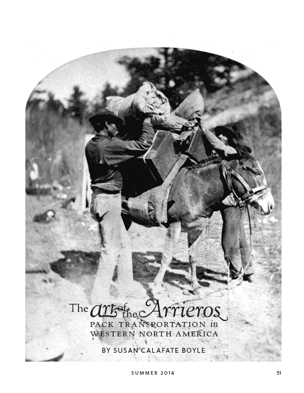
 One of my favorite parts of the design for Overland Journal is the title page for each article. Shown here is the feature article from the summer 2014 issue, which was completed in August. Interesting lettering on top of a striking image help catch the reader’s eye and draw them in to the text, and it gives me a chance to use swashes and ornaments, like that loop off the ‘s’ in ‘arrieros’.
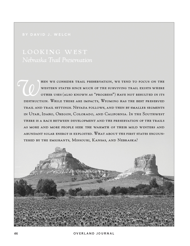
Shown here also is a variation on the idea. This is a regular column run in each issue, but we usually only have two pages to devote to it. The author often sends a beautiful image that would not make nearly the impact if run at a quarter or even half page, but the space considerations prevented giving it a full page with just a title. So here we do the title plus the first paragraph on the nice open sky, while allowing the subject of the photo (Oregon Trail landmarks Courthouse Rock on the left, Jail Rock on the right) much larger than we’d otherwise be able to. I also like to set off the beginning of articles by this author (Dave Welch), as the topic of trail preservation is an important one to the organization (the Oregon-California Trails Association), and his writing style–not too flowery and to the point–suits the highlight.
